Wednesday, May 28, 2014

Workshop Syllabus - 4 days


I had a request to repost the syllabus for my upcoming workshops:)

“For Love or Money: Portraiture and the Pursuit of Excellence” Four-day Syllabus
Chris Saper copyright 2003-2014

Day 1:     A.    Overview of Course
1. Introduction to your Business Plan
2. Introduction to Kelvin temperatures: tungsten, regular incandescent, fluorescent, and natural light options
3. Likeness and accuracy – The relative or brush- sizing method
4. Posing the model           
Instructor demonstration: Beginning the portrait –the seven-inch head- seeing  and mixing color; photographing the model
6. Painting the model in cool light
7. Photographing the model in cool light
8. Color, value and edge notes
Student painting – beginning the portrait - mixing and painting color notes; photographing the model
9. Preparing the photo reference: Sizing, scaling and proportion
                 B.    Business lab: Determining your business identity

Day 2:    A.    Painting lab: Morning session (Instructor demo optional)
1.     Photographing the model in warm light
2.     Beginning the portrait , making color notes
B.             Business lab:
1.     Developing your portfolio
2.     Pricing your work
3.     Presenting and showing your original work

Day 3:    A.    Painting Lab: Morning session
                                1. Power Point: Breaking the Chains of Photo Slavery
2. Painting from photographs, cool light- continuing Monday’s portrait
                 B.    Business lab:
1. Presenting your artwork effectively in visual media and shows
                                                Photographing your artwork; Preparing slides for shows and competitions
                                                Submitting your original artwork to shows and competitions
2.     Preparing your resource photographs
Adjusting photo size; Making the print
Day 4:    A. Painting lab: continue portrait from Tuesday – interpreting the photograph
1.     Composition and Value Massing
2.     Designing and Executing the multiple subject portrait

B.     Business lab:     Copyright & documentation; client relations; marketing

Monday, May 26, 2014

How to create a unified gallery wall of art in your home

Most artists I know (including me) are their own biggest collectors. Although I try to purge my studio periodically, there are still some pieces that are my favorites for one reason or another, so it's always a challenge to make myself  hang, arrange, and rotate art.

As part of my workshop, "For Love or Money", the framing and presentation of original work is a formal part of the discussions surrounding the business aspects of portrait painting. Selecting and buying frames makes the  most sense to me when it is done thoughtfully, so that several things are accomplished.

1. Standard sized art and frames creates maximum flexibility. I don't seal up the backs of my framed art with paper as many pro framers do - because I want to be able to easily and quickly pop pieces in and out of their frames.

2. Color and style of frames - consistent within groups. I have a batch of gold-hued frames, silver-hued frames and black frames. I also have these frames in simple plein-aire styles, simply designed frames and ornate Baroque style frames. But having a group of frames in similar color and/or style allows you to combine them indifferent ways to promote unity.

Other things I consider include: the scale of both the wall and the art; the color of the wall; and the type of lighting a wall will receive.

Below, this wall is painted a soft white and flanks a large window on the left - my friends Marlene and Eric Slayton came to help me hang the wall. (OK, actually I healed THEM hang the wall by holding the hammer and nails). This is the way the wall looks in natural daylight. You can see that there are a variety of different styles of frame, but they are all unified by their gold-hued color. Despite the face that there are quite a lot of different categories (several nudes, a large central print, some portraits and a landscape) - and media - (charcoal, pen and ink, oil, conte) the wall still holds together in a pleasing fashion. Most are mine, but the central print and landscape are by other artists.


 The opposing wall in this room is painted a bold and well-named color, Begonia (Sherwin Williams) and tends to bounce lots of strong ambient color around the space, much more pronounced at night when the overhead incandescent lights replace the natural daylight.The photo below is also taken under natural light. The frames on this wall are all very similar, a cool gold or warm silver in color.


And here are the two walls under the artificial incandescent ceiling lights in conjunction with the natural window light. This room has very high walls so the overhead lights are more evenly distributed than would be the case with walls that aren't so high.On the Begonia wall, the difference in the color temperatures of  the artificial (about 3500 degrees Kelvin) and natural light (about 6000 degrees Kelvin) are very obvious.


In my studio, though, the walls are painted a very desaturated cool greenish grey, middle value (Sherwin Williams, Anonymous) - they keep my studio from getting too much bright light bouncing about and also look great with portraits, since the wall color is a good approximation of the complement to skin tones. I'll add more on Studio color in a future Blog  post.


Friday, May 23, 2014

May 23, 2014 Demo, Mountain Artists' Guild, Prescott AZ

More details after the demo...but in the meantime, for those in attendance who did not get a handout, here it is:

Key Steps to Painting the Portrait from Life


1.      Define the color of light
2.      Pose and Light the model
3.      Place the subject on the canvas
4.      Size the head
5.      Establish vertical relationships
6.      Establish horizontal relationships
7.      Separate light from shadow
8.      Commit to the background
9.      Paint the darks as a value layer
10.   Paint the lights and middle values
11.   Refine the details and state the edges

Here is the quick - and wow! do I mean quick! demo - my beautiful subject gave me modeling time on her birthday! 


Saturday, May 10, 2014

Oil Portrait on Mylar: an Experiment in Grip & Slip

Open studios are the place to experiment with new materials, techniques, and approaches, so on Friday, something possessed me to grab a sheet of Mylar on the way to the Mountain Artists' Guild. Had I left a bit more time, I might have done a little Google research on how painters use the substrate, but I was late and didn't.

I stated the drawing with a bit of Raw umber, as I always do, and discovered right away that once the stroke is down, it stays there unless  it's wiped clean with mineral spirits.Also, it doesn't slip around like it would on linen.


I next tried to figure out how to cover the surface and used my brush to crosshatch and scrub in color :


This is how the surface looked:


Next, I discovered that the color I mixed on my palette appeared much darker than I expected:


Below, the addition of underlying reds in my model's skin tones:


It's not in my nature to have a light touch, so I had to fight it for the rest of the study - but I was really glad I did because it helped me experiment with using more impasto - assisted by Gamblin's Oil-free Solvent, which I've begun using on my regular palette

detail:


 And this is how it ended up when the clock struck twelve.


There's precious little detail in the sketch, but it also reminds me that detail isn't necessarily required to say what you want to in a painting.:)


Monday, May 5, 2014

Portrait Society of America, Reston, VA 2014

Every year we say that the staff at the PSA outdoes itself and every year is better than the last. But it actually is:) There is SO much going on, and everything of so much interest to portrait painters that I wish I could have been in three places at one, for the entire three days.

The program opened on Thursday night with the always-anticipated Face-Off, where fifteen artists and 5 models take over the Grand Ballroom and paint from life for 2 1/2 hours. Attendees can wander from easel to easel to watch the progress - there were some really fabulous painters and equally fabulous results. Below, icon Max Ginzburg shows his techie side as he watches three artists at work.


Below, David Jon Kassan and Quang Ho at their easels:


Juliette Aristides's beautiful piece, below:


Friday began with a bang - a packed day of demonstrations, panel discussions, culminating in the 6x9 Mystery Sale, where 100+ invited faculty and artists' small donated works are 'bid' on in a frenetic 30 minute event...the panels are signed only on the back so very often the buyer doesn't know the artist until after the panel is purchased.

Here's one small treasure that I brought home, painted by my friend, Richard Broderick.


Here is the piece I donated:


On Saturday morning, my three - artist panel spoke on various aspects of Promoting Your Art in the 21st Century - you can catch up with some of the details here on the Cecilia Beaux Forum Blog.

I dashed from the EARLY discussion to the Exhibitors' hall for my demo of fellow artist Oscar Peterson, using Gamblin Colors, Rosemary Brushes and the New Wave hand-held art palette.

Here are some pics from the demo:


For those of you who have attended the PSA conferences in the past: I think you'll agree that that they fly by just like this, as photographed and edited by artist Garth Herrick:


Friday, May 2, 2014

PAOA Show Opening and Demo, Bezalel Gallery, Scottsdale, May 1, 2014

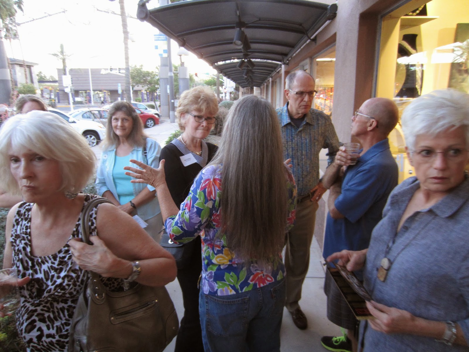
The 4th Annual Portrait Artists of Arizona's Exhibition opening to a wonderfully packed crowd, and a most fortuitously "cool" evening for artist Penny McElhaney and me as we demonstrated painting from the live model - outside. (artist Jean Hildebrant struggled in air-conditioned comfort inside the studio....) If you don't live in Arizona there's no way to imagine the temperature volatility of heat this time of year - 90 degrees is pretty tolerable if you're not in direct sunlight, but I  doubt the high even made it to 90 yesterday:)


Since we started painting at 6:30, it was still daylight, but we lit our model from above and to our left with an artificial light. Then dusk happened. The automatic spots lighting the sidewalk area came on -and fought the artificial light for a while. Then night happened. We had to remove the artificial light on our model, allowing the spots which were now lighting our model, to completely take over (fortunately the angle of the light was somewhat similar) ...and reposition the artificial light behind us so we could try to see what in the world we were doing. Our compassion for Jean and her air-conditioned environs and beautiful, controlled, and wonderfully predictable lighting grew by leaps and bounds. Anyway it was the most peculiar lighting situation I've ever seen, but all around, lots of fun.

Above: you can see that sundown was approaching and that our beautiful model Amy, was lit only by my artificial light. Penny and I discussed earlier that we would try not to commit too much to the shadow shapes until we could see what happened after dark.

Below, the pre-sunset drawing stage.


 Below: color notes and a general obliteration of the drawing.


Below: you can see the odd cast shadow on the lower left of my canvas from the artificial light, now placed behind us.

Finally, what the painting looked like once I got it home last night.


 "Amy", by Chris Saper. Oil, 20 x 16, on Fredrix Blue Label canvas.

Thursday, May 1, 2014

May 1 2014 Demo: Portrait Artists of Arizona's Exhibit Opening at Bezalel Gallery

Welcome! Have you noticed the QR code on the back of my dress? At 7:00 tonight, I'll take a quick break - the first three people who show me that they've scanned the QR code and commented here on my blog will go home with a little surprise!

Wednesday, April 23, 2014

National Portrait Gallery April 22, 2014

Yesterday I had several hours to wander the NPG in Washington, DC, fully intending to go straight to the American Presidents section in case my time ran short - but got seriously sidetracked with all of the Civil War exhibits. The narratives alongside each painting or photograph told a quick history of the United States from the standpoint of key political and military figures' portraits. The experience reminds me of how much I've forgotten from early school history, and how fiercely troubled and appalling were the circumstances surrounding slavery, the taking of land from Native Americans and the Civil War, which remnants of hatred and prejudice are still being fought.

I particularly was moved by the amazing life masks made of Abraham Lincoln in 1860, when he began his Presidency, and in 1865 -


In the wing that has the Presidential portraits, I particularly delighted in studying the historical portraits, having quite a different insight after twice having heard John Howard Sanden's riveting presentation of his research and experience in recently painting George W Bush's official White House Portrait. I loved George Healy's portrait of President Van Buren.


The contemporary portraits are just as fabulous, no less so than because I have had the extreme pleasure of meeting two of the artists who painted them... Robert Anderson Alexander's portrait of George W Bush here:
(and look at these beautifully painted hands!)

Everett Raymond Kinstler's portrait of Gerald Ford here:


Below, Ronald Sherr's timeless painting of George H W Bush (I have not yet had the chance to meet Ron in person but hope to do so soon :)

And as a PS, the portrait of one of my relatives, colonial Governor William Shirley, was in the NPG gallery last time I visited but it has now been moved (into storage? to another zip code?) In any case, perhaps that would come as no surprise since what I have been able to learn about him includes general scandalous behavior, incompetence. and other generally disparaging things- he was kicked out of Massachusetts so it is probably fitting that the Smithsonian gave him the boot, too LOL)

And here is the other very cool thing I saw, the well-named exhibit, "American Cool", a collection of (mostly) photographs of people who defined 'cool' - everything from Muddy Waters to Lenny Bruce to James Dean, to Angela Davis to Marlon Brando to Hunter S Thompson...here are a few:

Richard Avedon's photo of Bob Dylan:

Annie Leibovitz's pic of Johnny Depp:


Linda McCartney's photo of Jimi Hendrix:


As I was leaving the exhibits, here was this wonderful collection of license plates, "We the people..."


...and then just before actually leaving, I went to the gift shop where I hoped to find a t-shirt with the Jimi Hendrix photo and nearly fell over backward to see my book on the gift shop shelf. Holy moly.


Sunday, March 16, 2014

Travel updates

Here is what's on my calendar - if you have been planning a commission, it is a cinch to piggyback onto an existing trip! Just let me know:)

April 18-28, 2014: Washington DC
June  4-9, 2014:  Bennington,VT
June  26-29: New York City
October 8-13 Grand Rapids area, Michigan

Oil Painters of America 2014 National Juried Exhibition: Kirk Larsen: American Artist

I am really thrilled that my portrait of plein-aire painter Kirk Larsen has been selected for the upcoming OPA Exhibition in Bennington, VT, this coming June. The Bennington Center  for the Arts has become quite iconic for representational fine art painters, hosting shows and exhibits for some of the most respected artists working today.

While images from the participating artists aren't yet available, I've seen some of the work that was accepted, and the show promises to be a "Wow". Last year's exhibit at the Insight Gallery in Fredericksburg, TX was the first I've attended, and I have to say I enjoyed not only seeing some of my old (meaning not recent, LOL) artist friends, but also making some really wonderful men and women whose friendships will, I  know continue to grow.


I'll post more photos of the Exhibition after the June event!